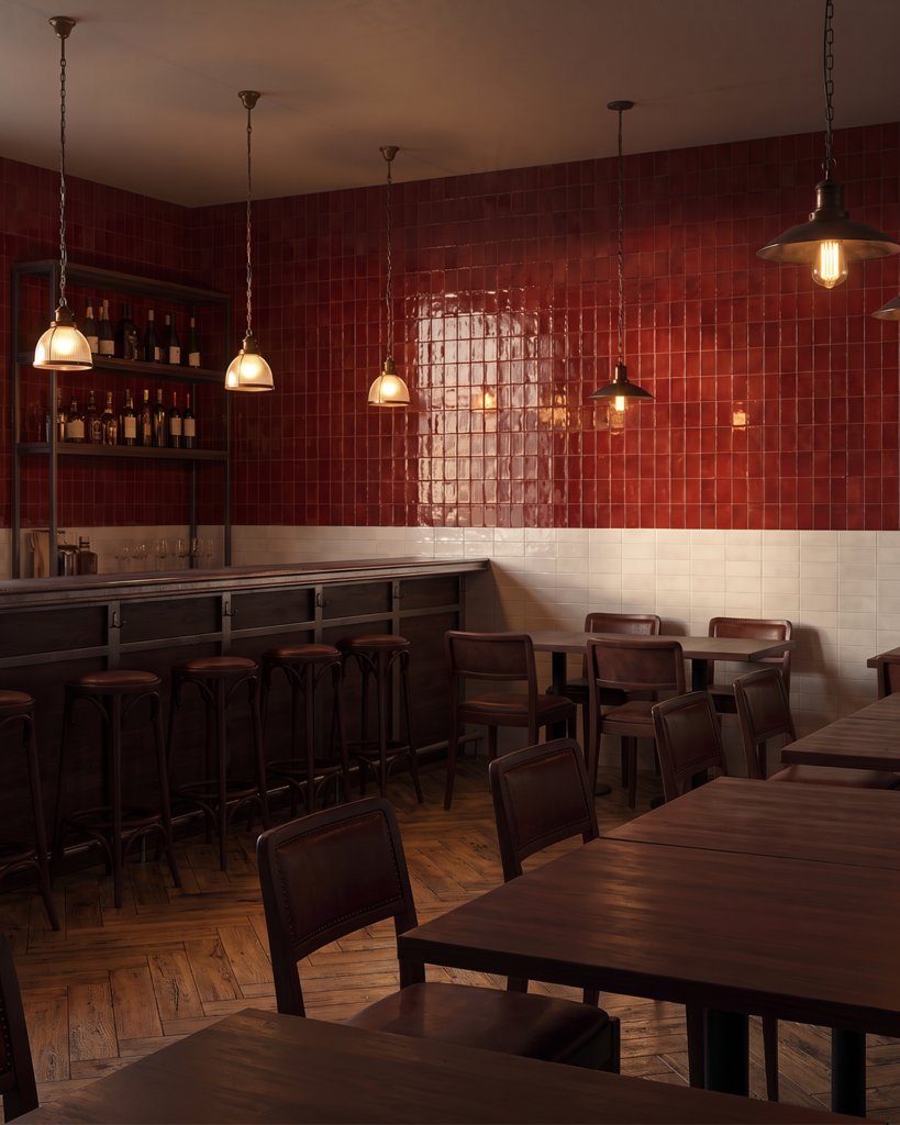
Colour does more than define a palette. It shapes how a space is perceived — influencing its atmosphere, sense of depth and relationship with light. From muted, mineral tones to richer, more saturated hues, colour can bring warmth, create contrast or lend a space a quieter, more considered character.
We explore five colours informing interior schemes today, with a closer look at how tone, texture and material can be used to shape the mood of a space.
01/ Dusky Plum
Colour with depth and quiet intensity.
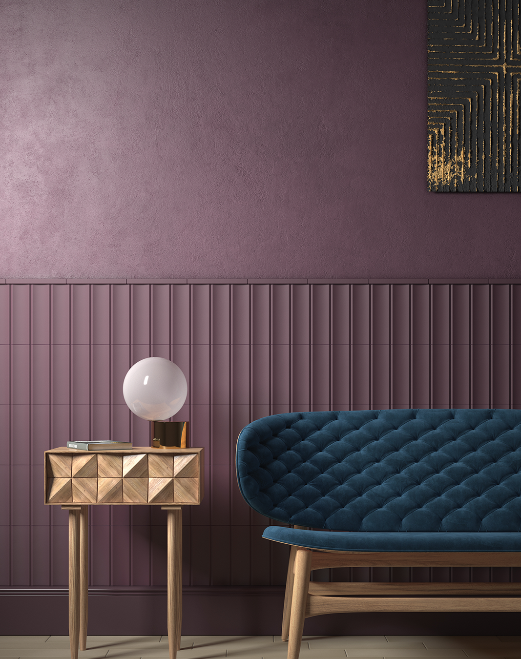
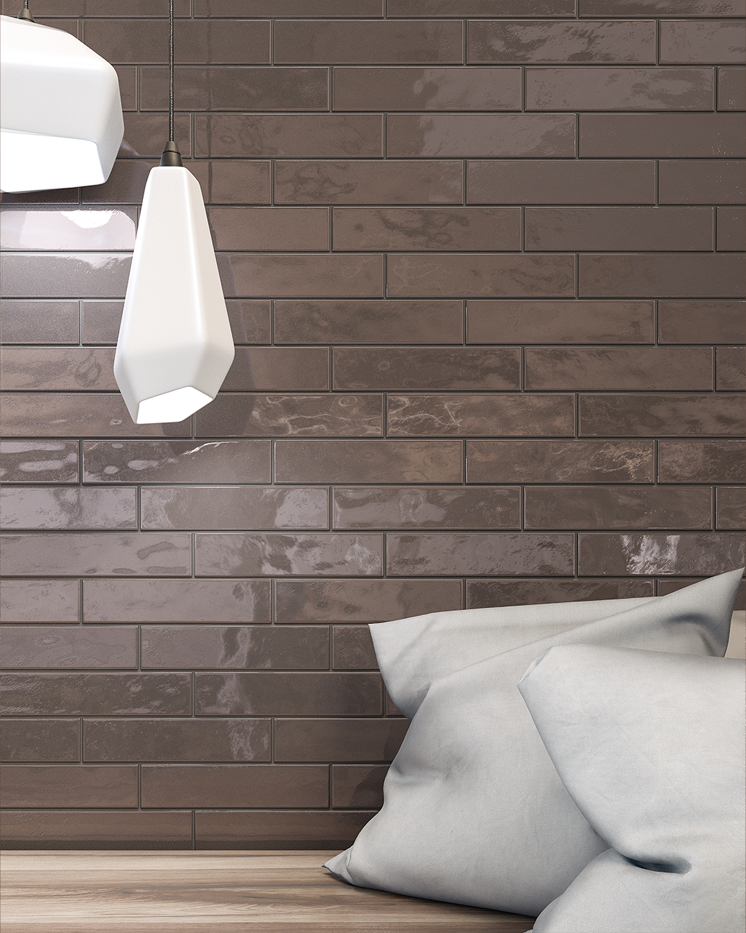
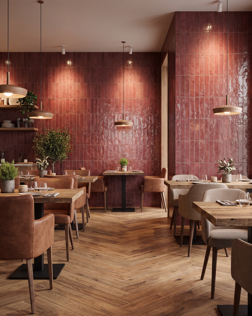
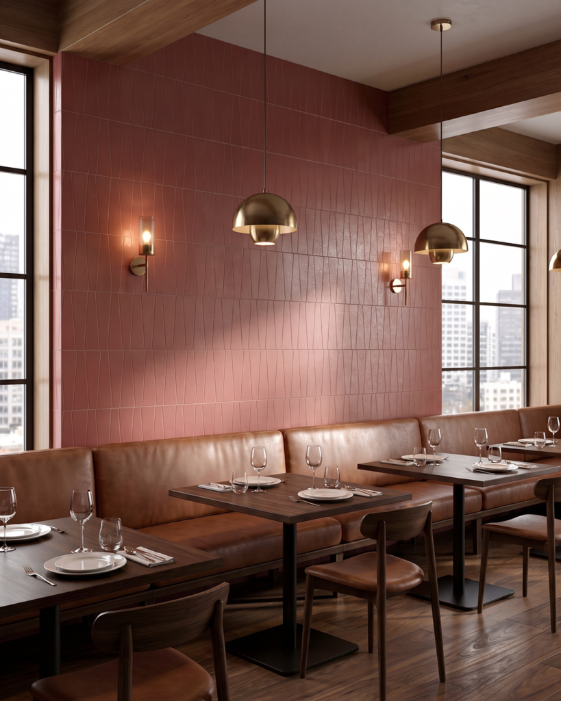
Moving beyond traditional neutrals, dusky plum brings a more atmospheric quality to interior schemes. Its complex balance of red and violet creates depth without the visual weight of a darker, more saturated shade.
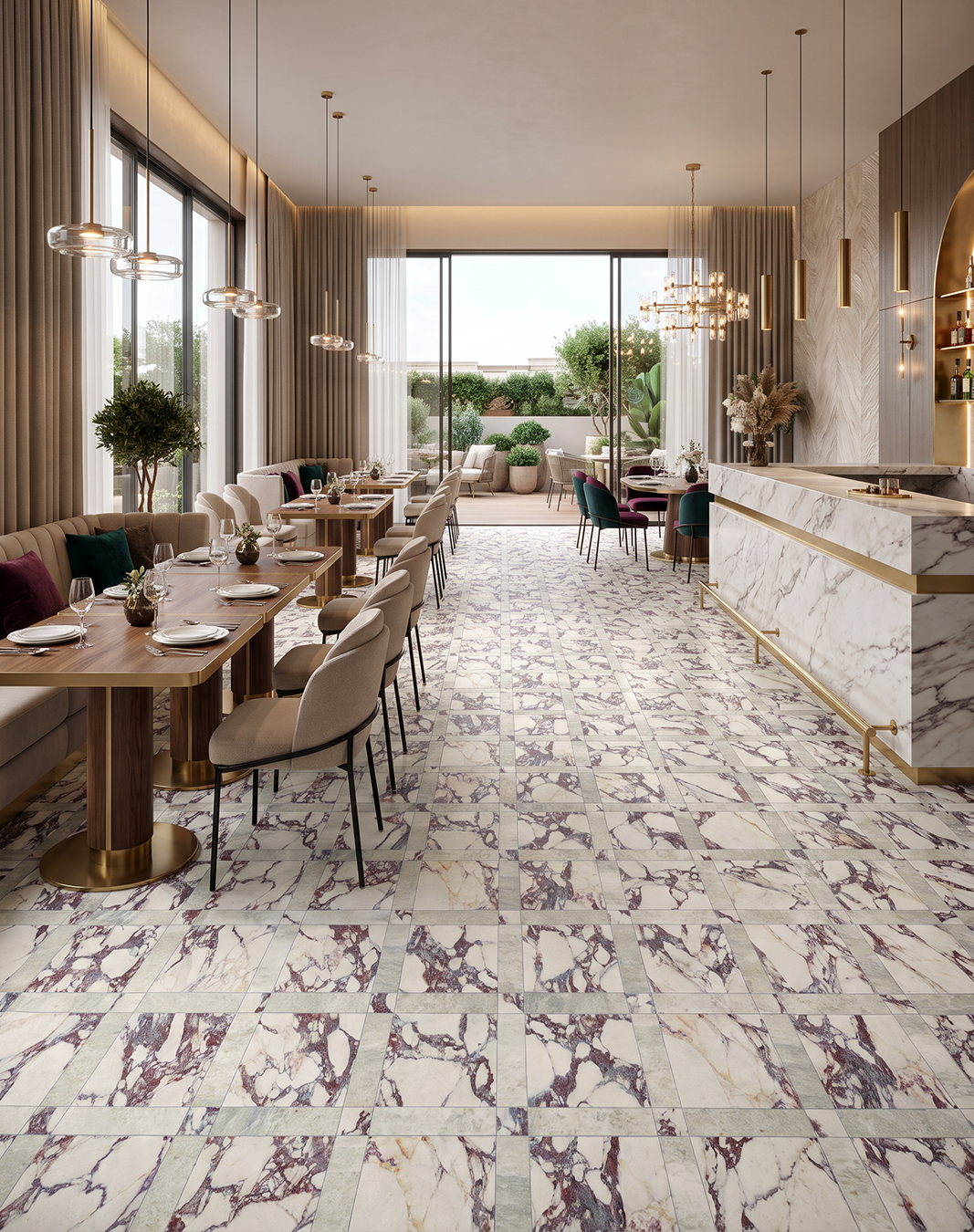
The key is in the pairing. Set against warm stone, muted taupe or natural timber, plum feels grounded and understated. Introduce it through glazed tile, tactile surfaces or a defined feature wall to create contrast, draw the eye and establish a stronger sense of place. In hospitality and leisure interiors, it offers a way to build atmosphere without relying on bold pattern or high contrast.
Consider it for: Restaurant interiors, bars, hotel lounges and feature walls where colour can help define the mood of a space.
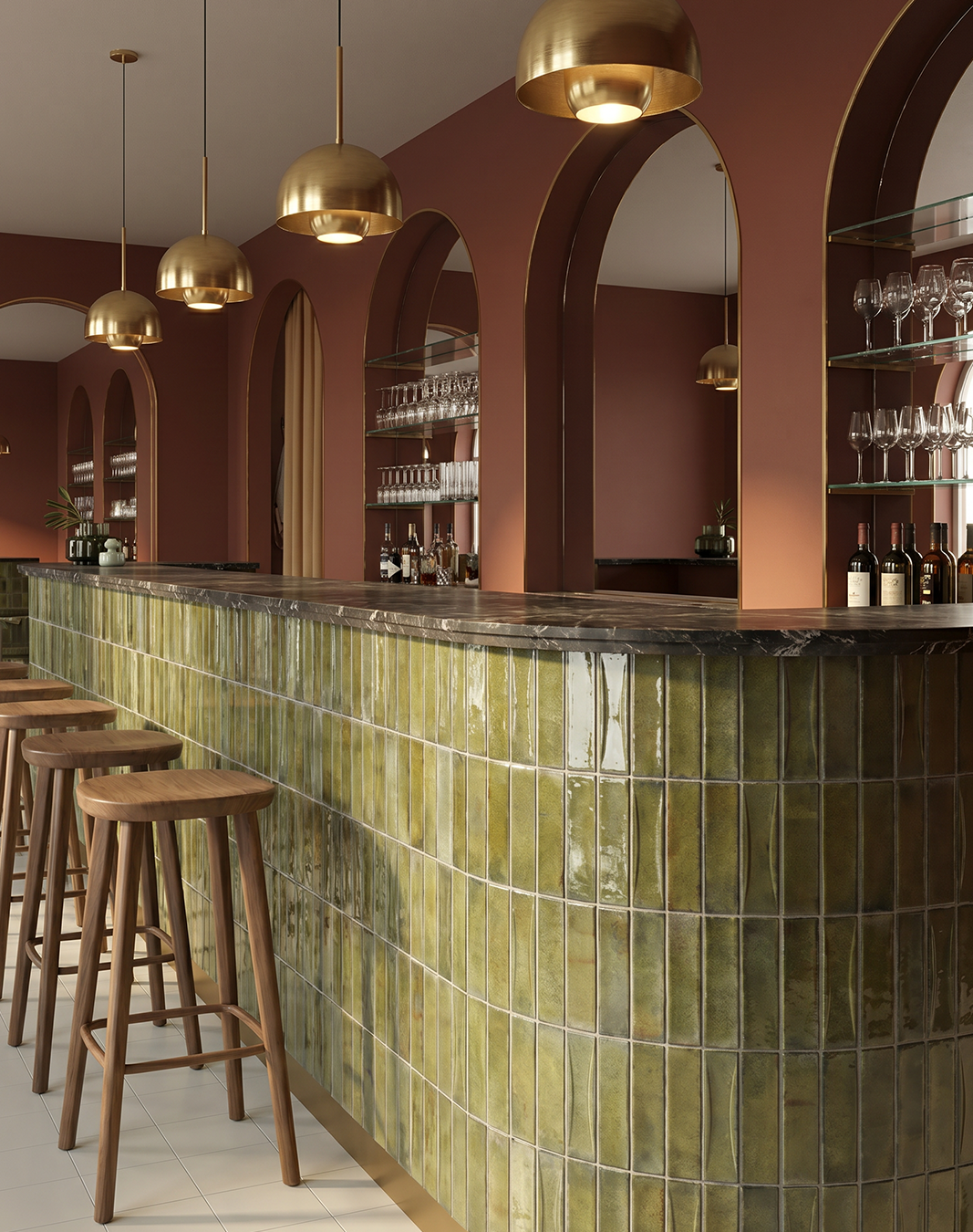
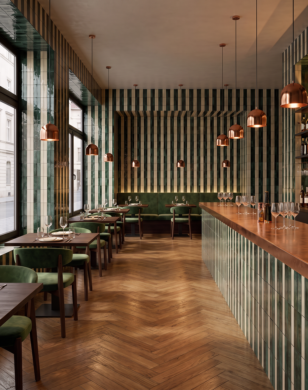
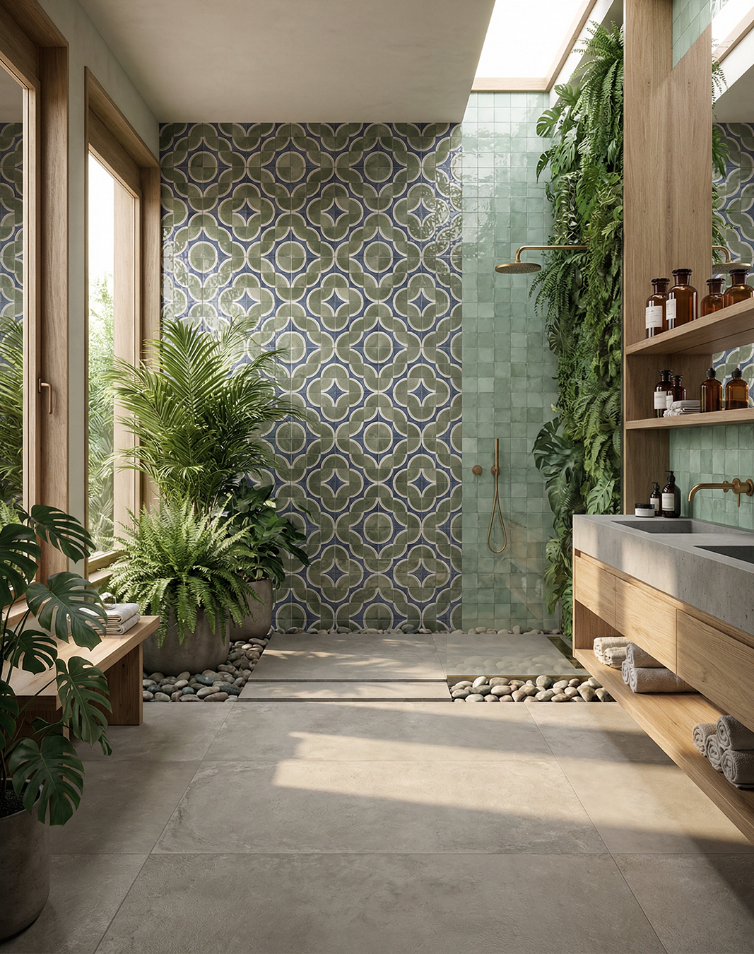
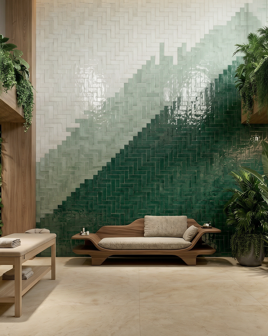
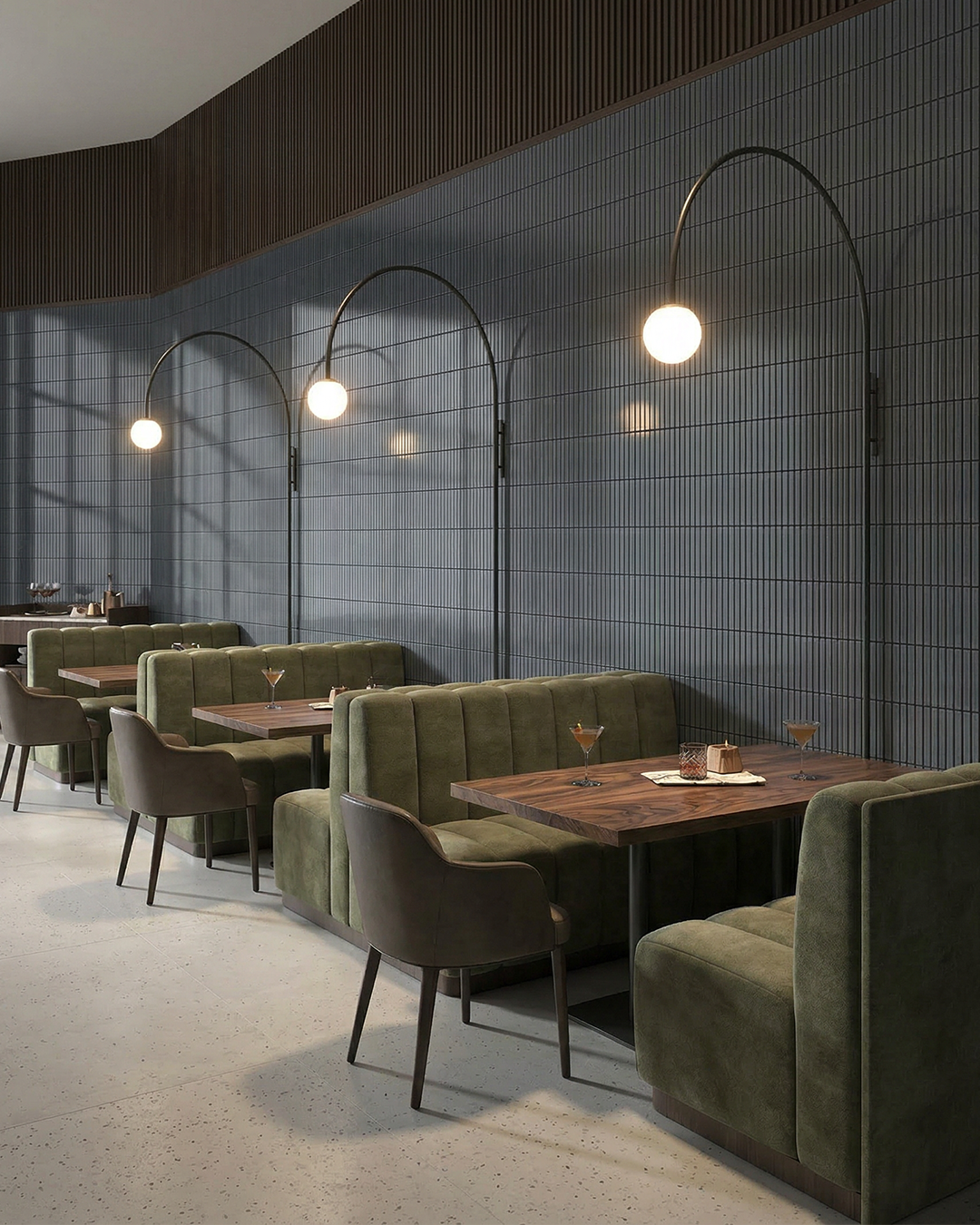
From softened moss to deeper olive, earthy greens offer an alternative to conventional neutrals, bringing colour into a scheme while retaining a sense of restraint. Their natural associations lend themselves to spaces designed to feel calm and considered, while deeper, more saturated tones introduce greater definition and visual weight.
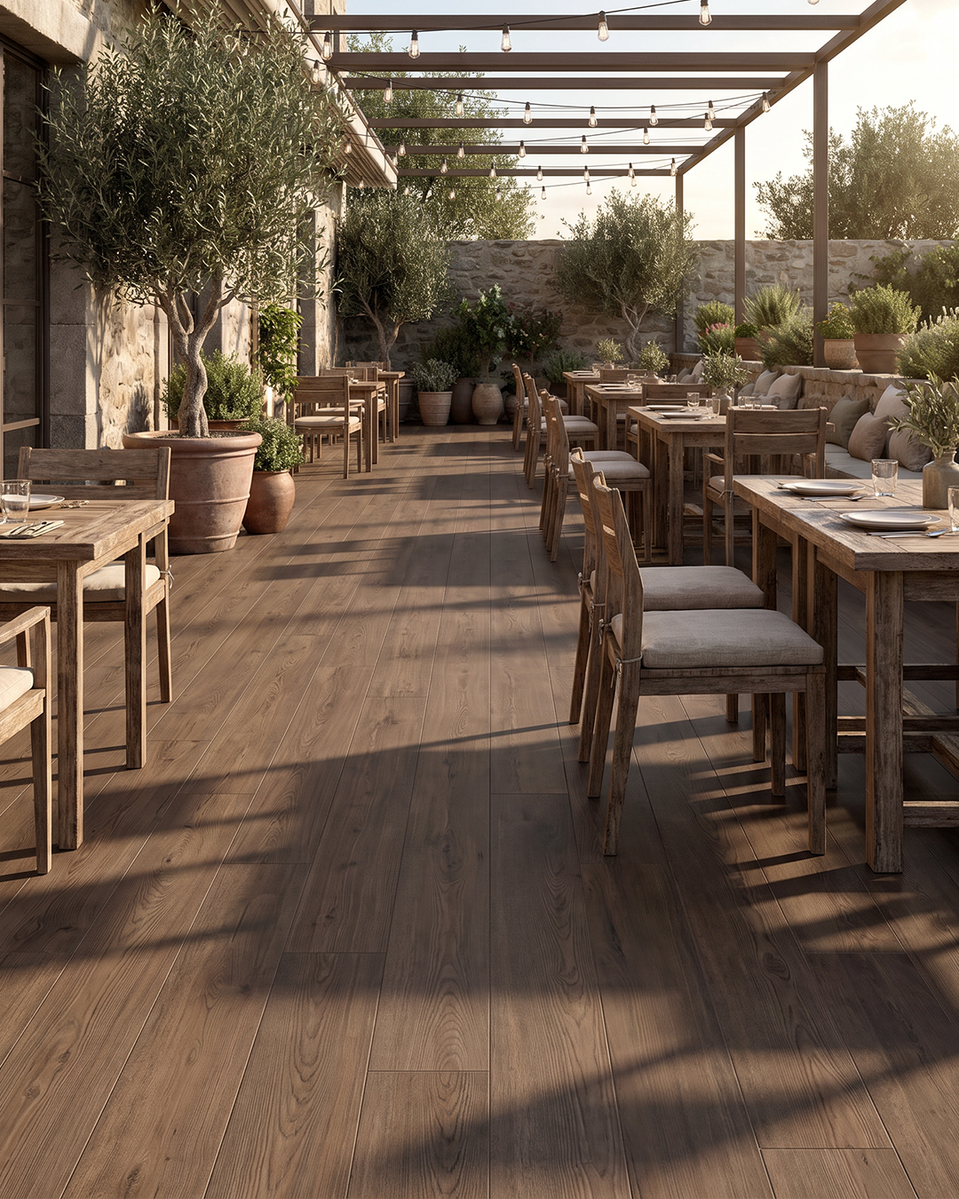
Material pairings are key. Green sits comfortably alongside warm timber, natural stone and muted metallic finishes, with variations in glaze, texture and tone adding depth to the overall palette. Used across a larger surface, it can establish a strong visual anchor; introduced in smaller areas, it offers a more subtle connection to the natural world.
Consider it for: Hospitality, wellness, workplace and residential interiors where materiality and atmosphere are central to the design.
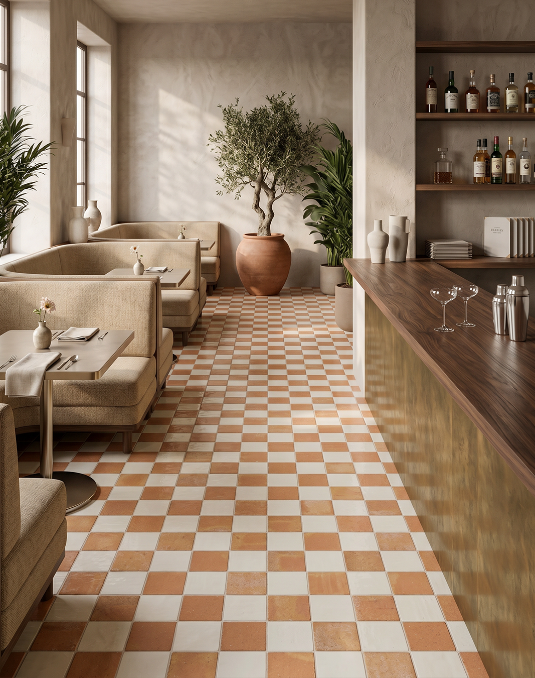
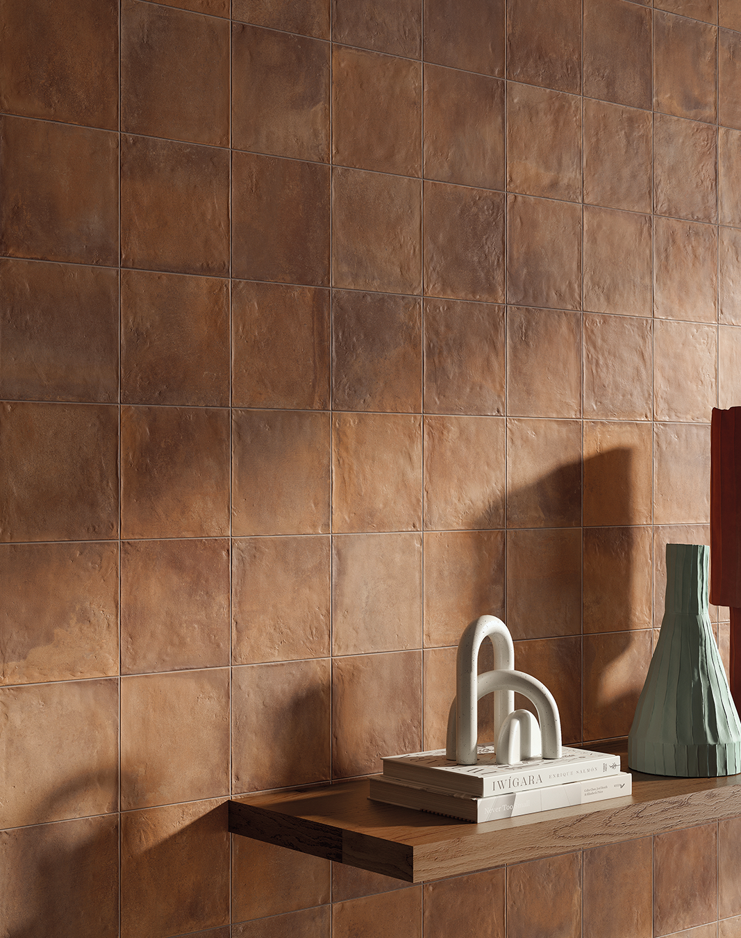
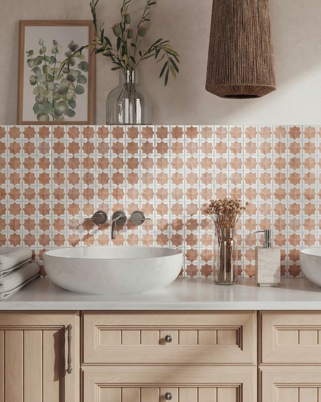
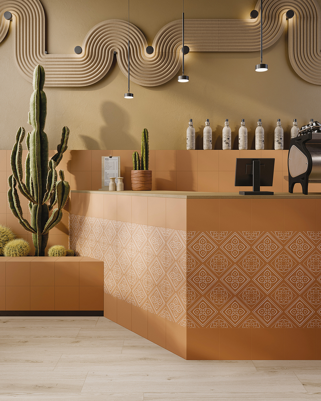
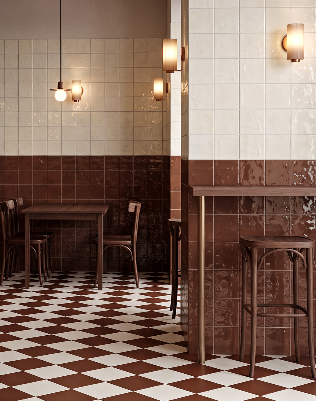
Drawing on the natural pigments of clay, terracotta and rust, these warmer hues bring depth and character to interior schemes. Their earthy undertones give colour a grounded, material quality, sitting somewhere between a neutral and a more expressive accent. The result is a palette that feels welcoming without demanding attention.
Warm clay tones pair naturally with chalky neutrals, pale stone and textured timber, while tonal variations in glaze and surface finish can introduce subtle contrast. Used across walls or as a defining feature, they lend themselves to spaces where atmosphere and material character are as important as the overall palette.
Consider it for: Cafés, restaurants, reception areas and shared spaces where warmth and a sense of welcome are central to the design.
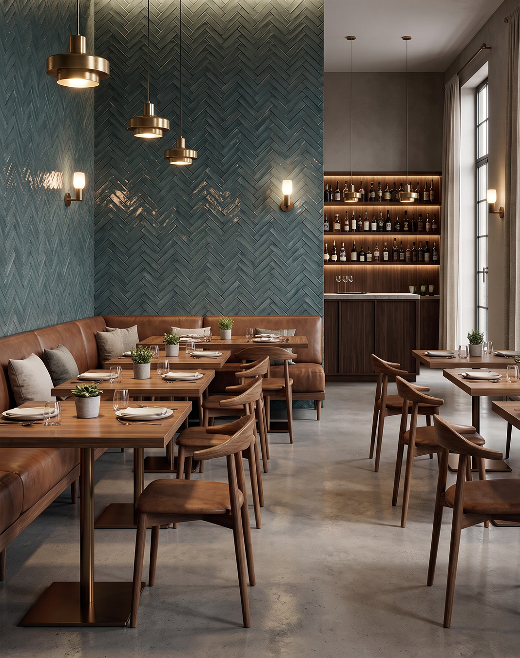
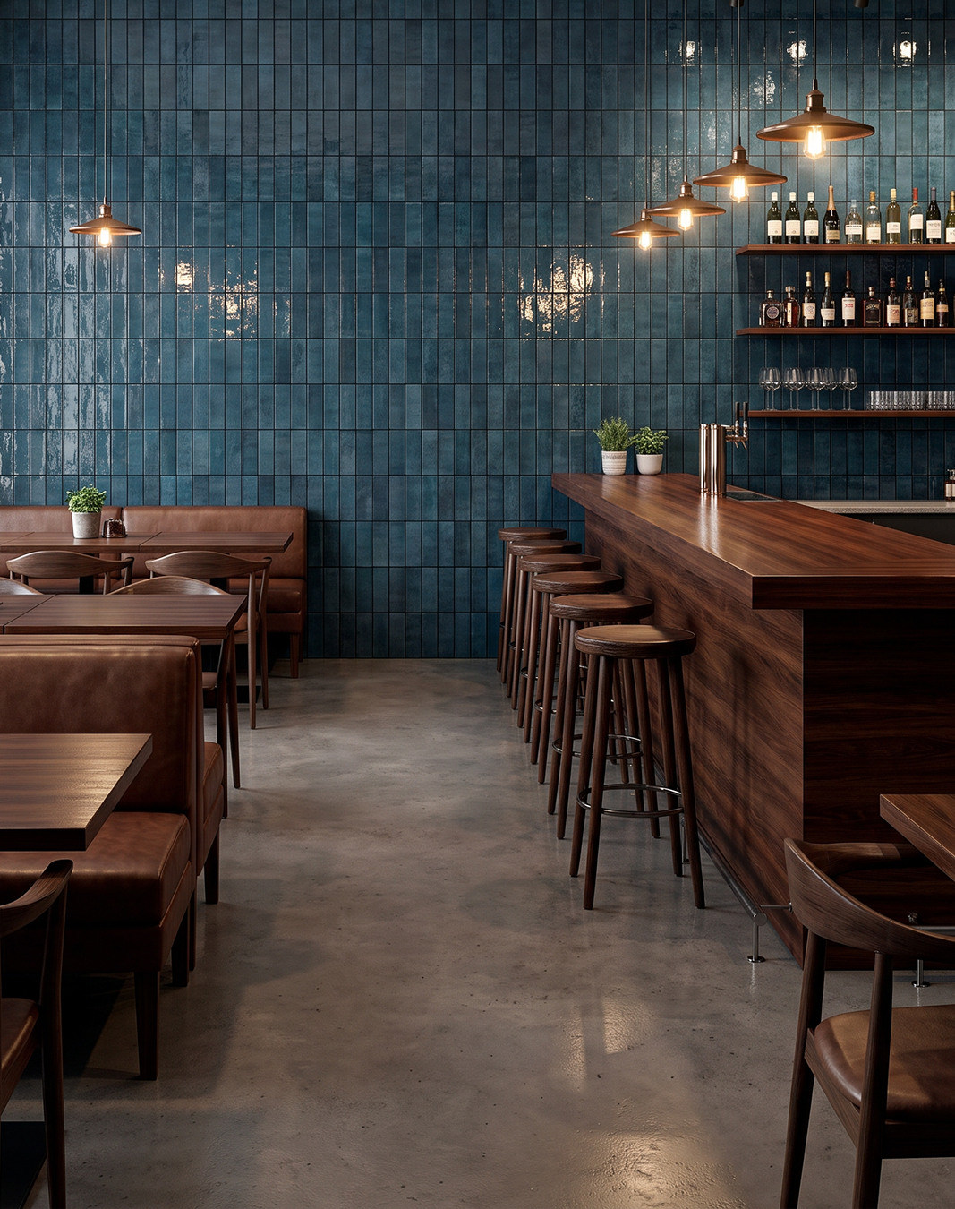
Drawing on the depth of slate, the intensity of petrol blue and the subtle variation of mineral pigments, these blues bring a cooler dimension to interior palettes. Their muted, complex undertones lend colour a sense of permanence, balancing a contemporary edge with a quieter, more restrained character.
The contrast with warmer materials is where this palette comes into its own. Pair slate and mineral blues with natural timber, cognac leather or burnished brass to create depth through differences in tone and temperature. Glazed finishes can introduce movement and reflect light, while more matt or textured surfaces offer a softer, more understated expression.
Consider it for: Hospitality, bars, restaurants and workplace interiors where contrast, material richness and a more considered atmosphere are central to the scheme.
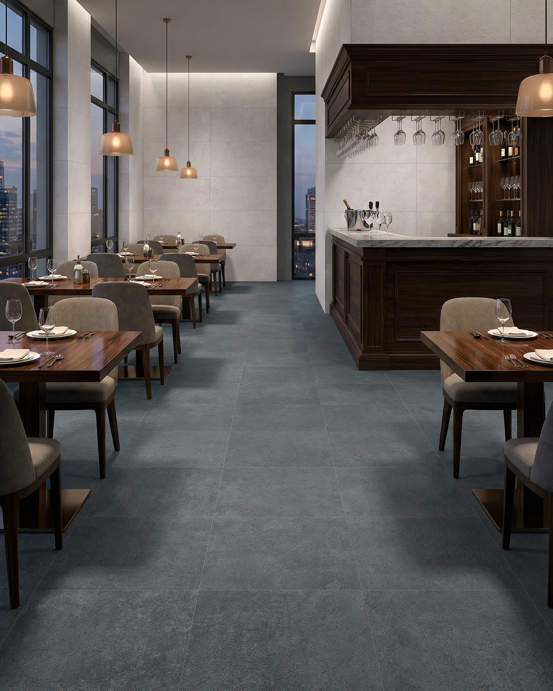
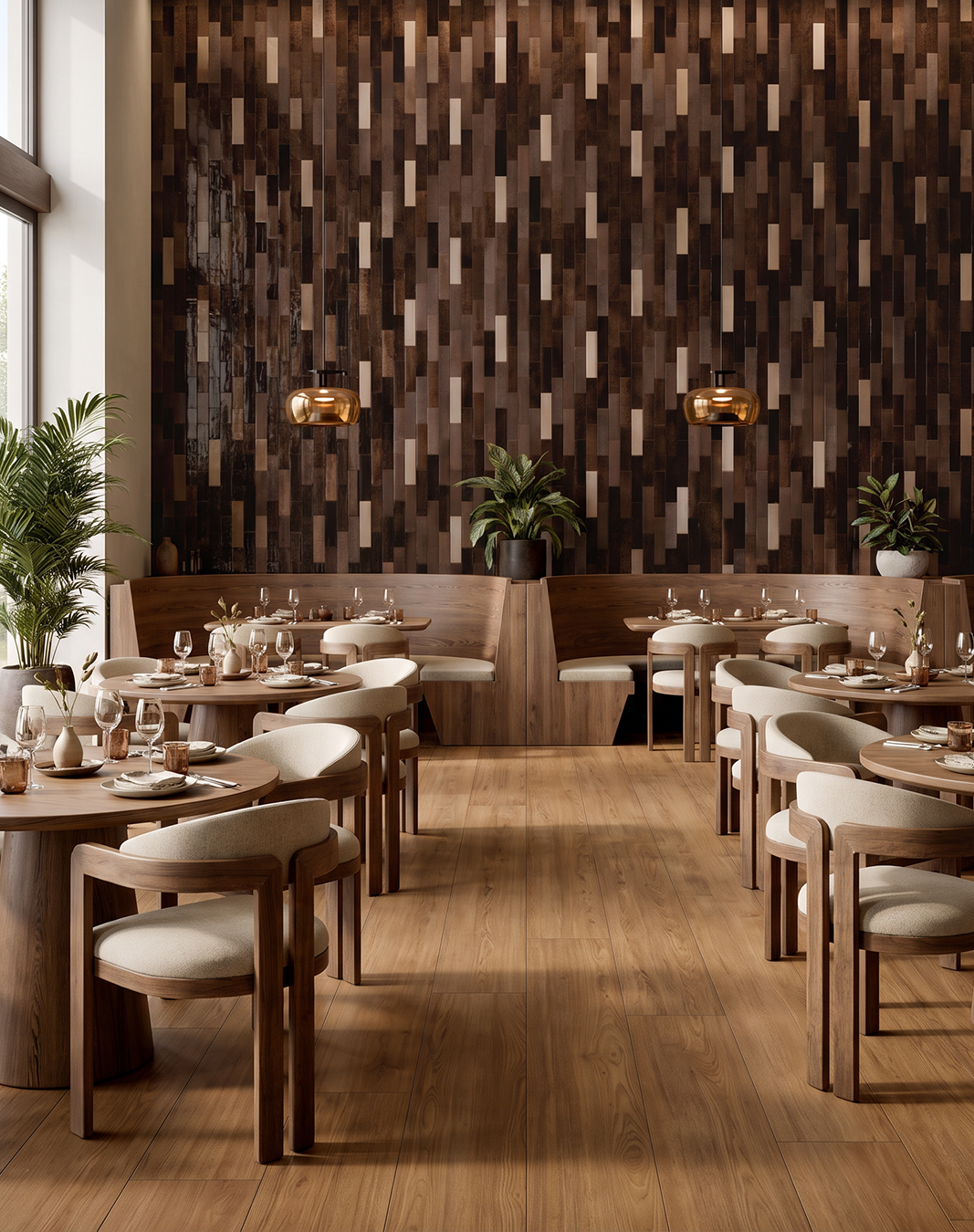
Brown is taking on a more prominent role in contemporary interiors, moving beyond its association with timber and traditional finishes. From deep chocolate and roasted coffee to tobacco and softer, earthy browns, these tones bring weight and warmth to a palette, with a richness that feels both grounded and contemporary.
Their versatility lies in the interplay of tone and texture. Pair deeper browns with warm stone, muted neutrals and tactile finishes to create a layered, cohesive scheme, or use glossy glazed surfaces to introduce contrast and catch the light. Across a wall or as a defining detail, brown offers an alternative to black for adding depth without the same starkness.
Consider it for: Restaurants, bars, hotel interiors and workplace settings where tonal layering and material character help establish the atmosphere.
Rich pigment, tactile surfaces, considered impact.
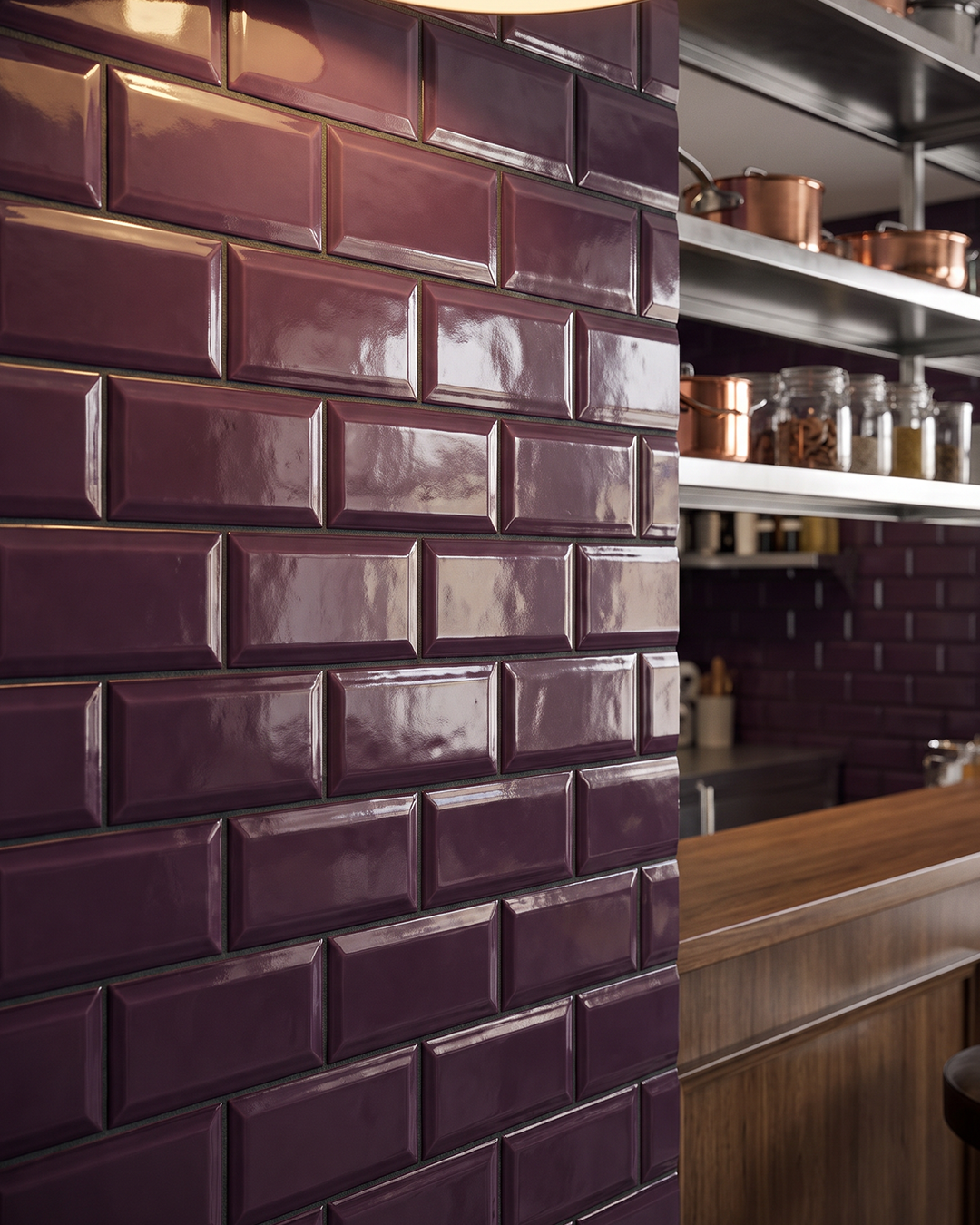
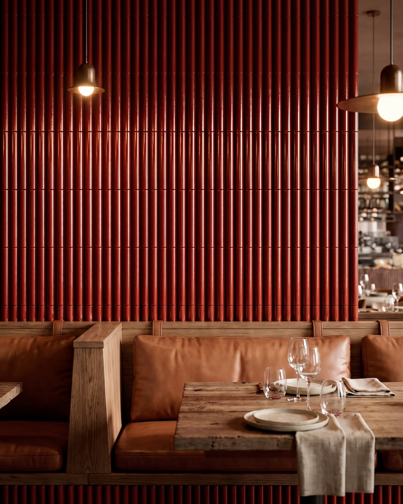
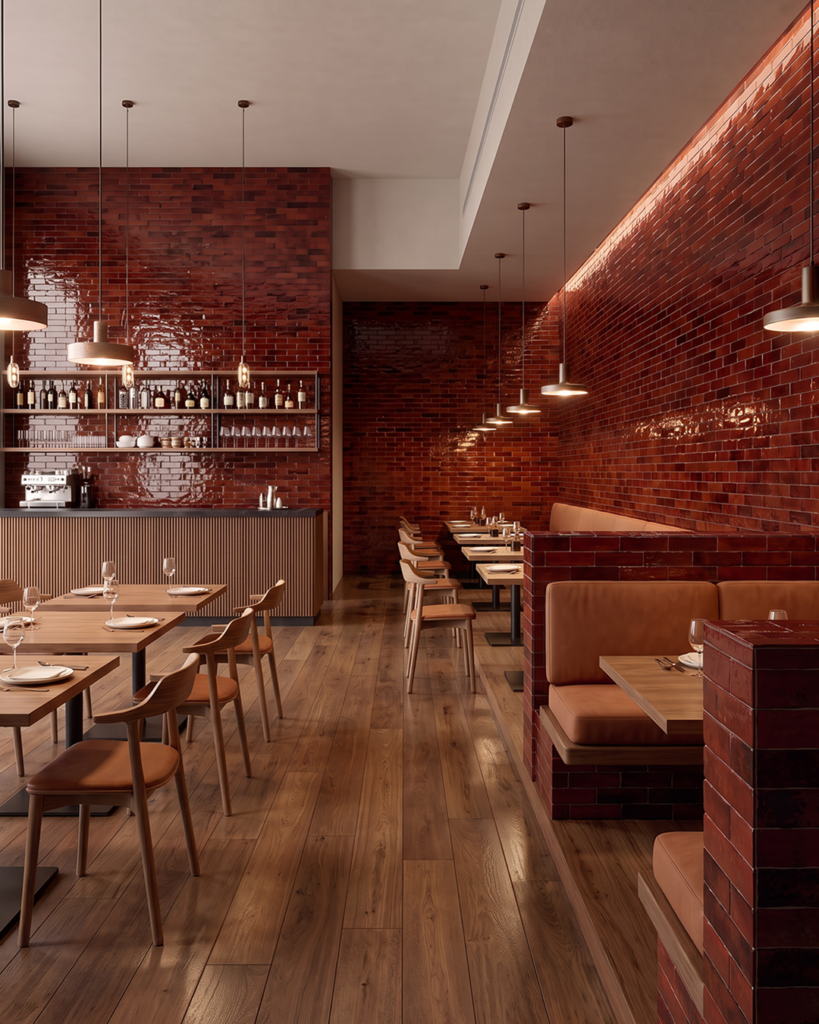
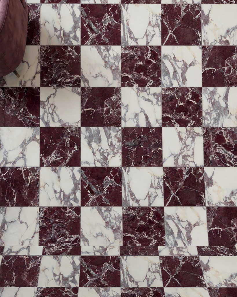
Deep reds bring a renewed intensity to commercial interiors, adding warmth and depth while making colour a defining part of the architecture. From the dark, brown-red undertones of oxblood to the vibrancy of crimson, these shades offer different ways to introduce drama without relying on pattern or excessive contrast.
Surface finish plays a significant role in how the colour is experienced. Glossy glazes catch and reflect light, while ribbed profiles and textured brick surfaces create variation through shadow and relief. Applied to a bar front, feature wall or full-height elevation, deep red becomes more than an accent — it helps establish the identity and atmosphere of a space.
Consider it for: Hospitality interiors, bars, restaurants and feature elevations where colour and surface can become an integral part of the design.
Let's Talk Through Your Project
Need help specifying or exploring our new tile collections? Contact your local Grestec Area Manager to request physical samples, review specs, or discuss your upcoming scheme.